In the ever-evolving landscape of digital services, meal subscription apps have emerged as a convenient solution for busy individuals and families seeking to simplify their meal planning and preparation. Hello Chef is a fictitious company designed to provide users with a seamless and enjoyable experience subscribing to personalized meal plans.
This case study explores the end-to-end design process of the Hello Chef app, aimed at offering users an intuitive platform to choose their desired meals, manage their subscriptions, and enjoy a variety of recipes tailored to their dietary preferences and lifestyles.
As the sole designer and researcher for this project, I embarked on a journey to understand target users and their needs related to meal planning and delivery. This case study covers the initial steps, including user research and early design stages, highlighting the key insights and decisions that have guided the development of the Hello Chef app. Although this project is still a work in progress, I am continuously working on it to ensure further growth and refinement.
2. Research Stage
Objectives
Understand user needs, pain points, and preferences regarding meal kit delivery services.
Method
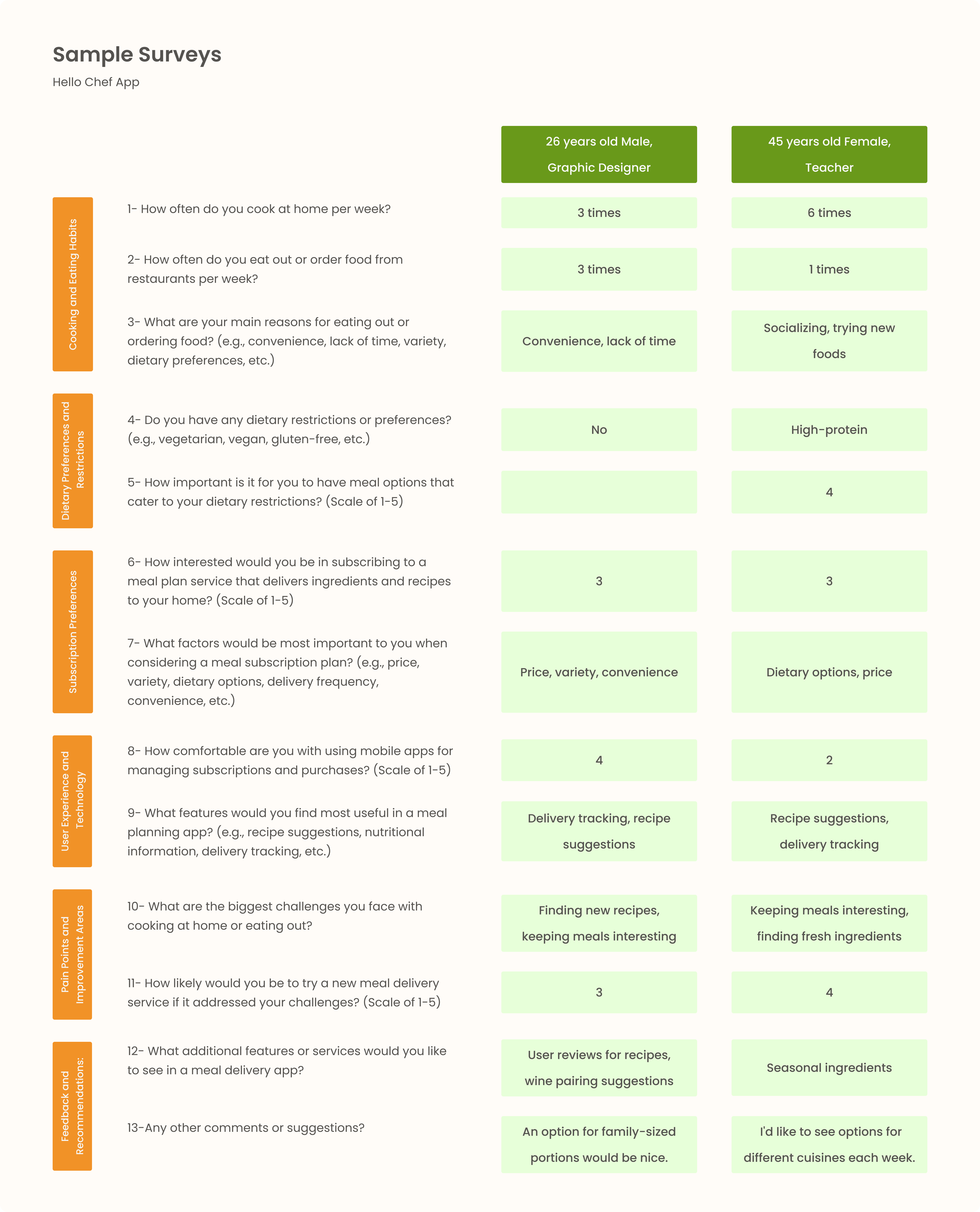
Distributed around 30 survey papers to a diverse group of people to understand their cooking habits and preferences and the pain points they encounter in their cooking process.
I distributed the survey papers to a diverse group of people in three nearby parks, engaging with individuals from various backgrounds such as housewives, teachers, students, and even a graphic designer taking a well-deserved break amidst the greenery.
After they completed the survey questions and handed them back to me, I proceeded to analyze the answers at home.
Key Findings
Users prioritize fresh ingredients, a variety of healthy recipes, and ease of cooking.
Common pain points include complicated recipes and delivery issues. Additionally, many respondents expressed challenges with not knowing what to make for meals, especially when catering to family members with different dietary restrictions, making meal planning more difficult and time-consuming.
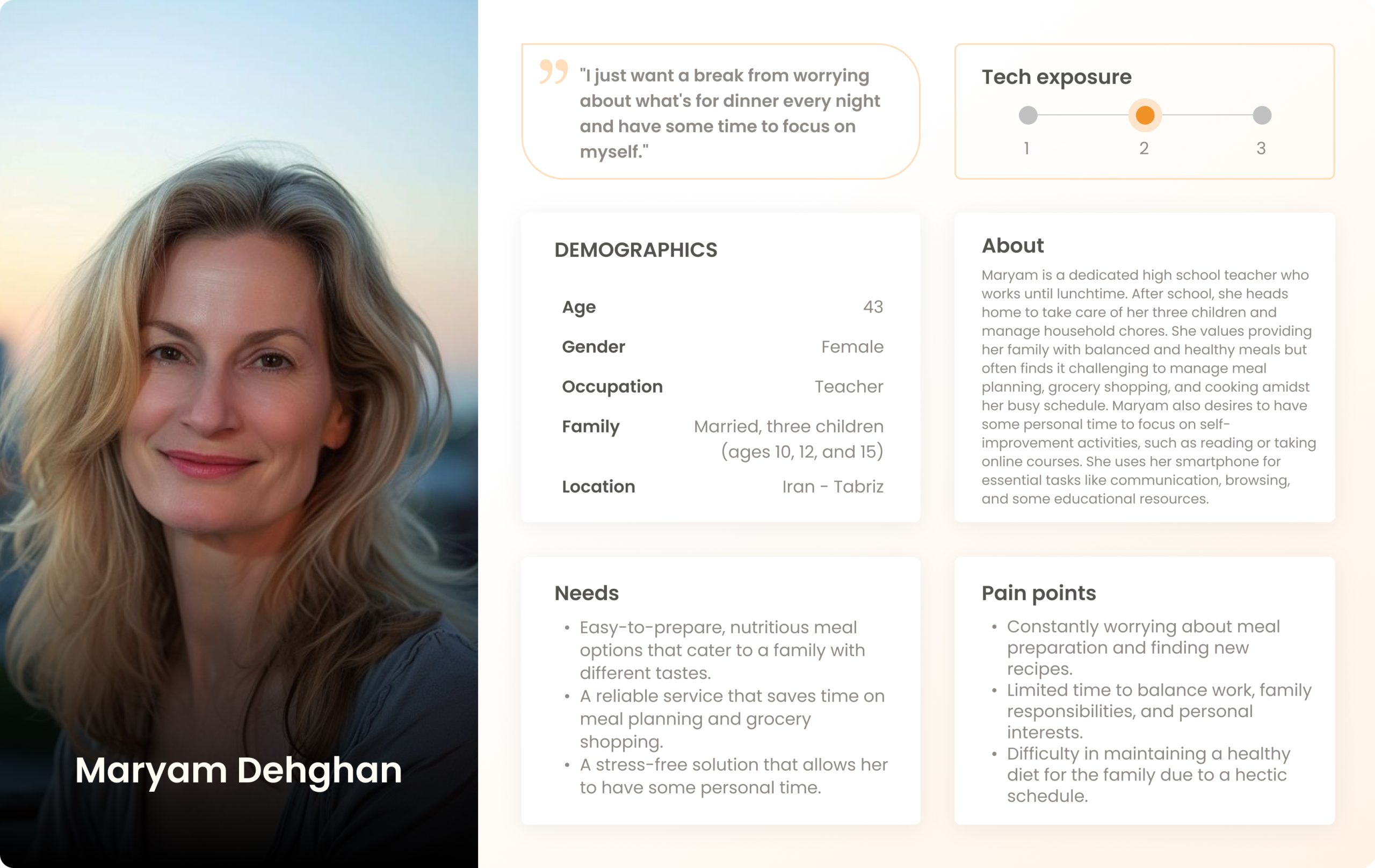
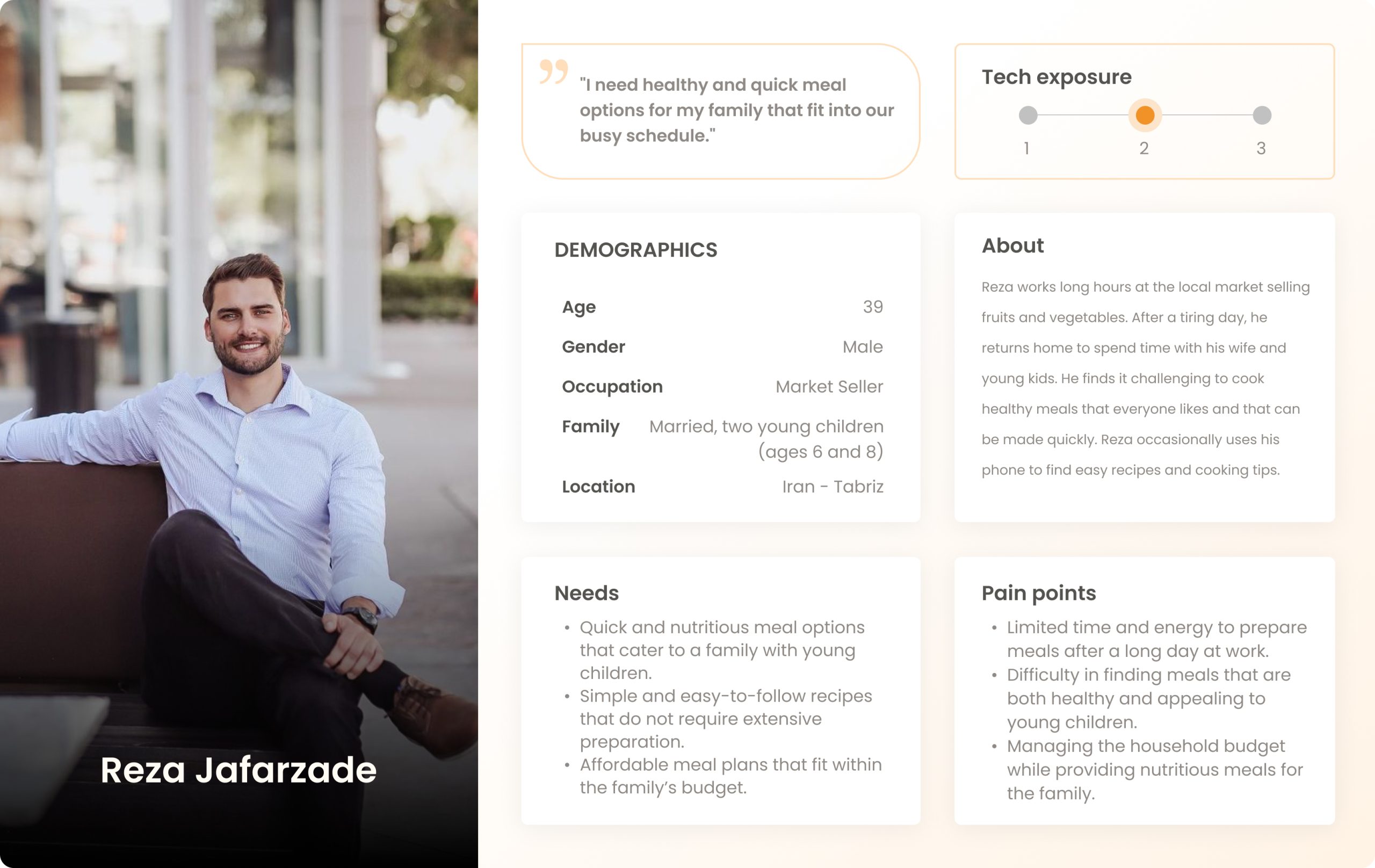
3. Persona Phase
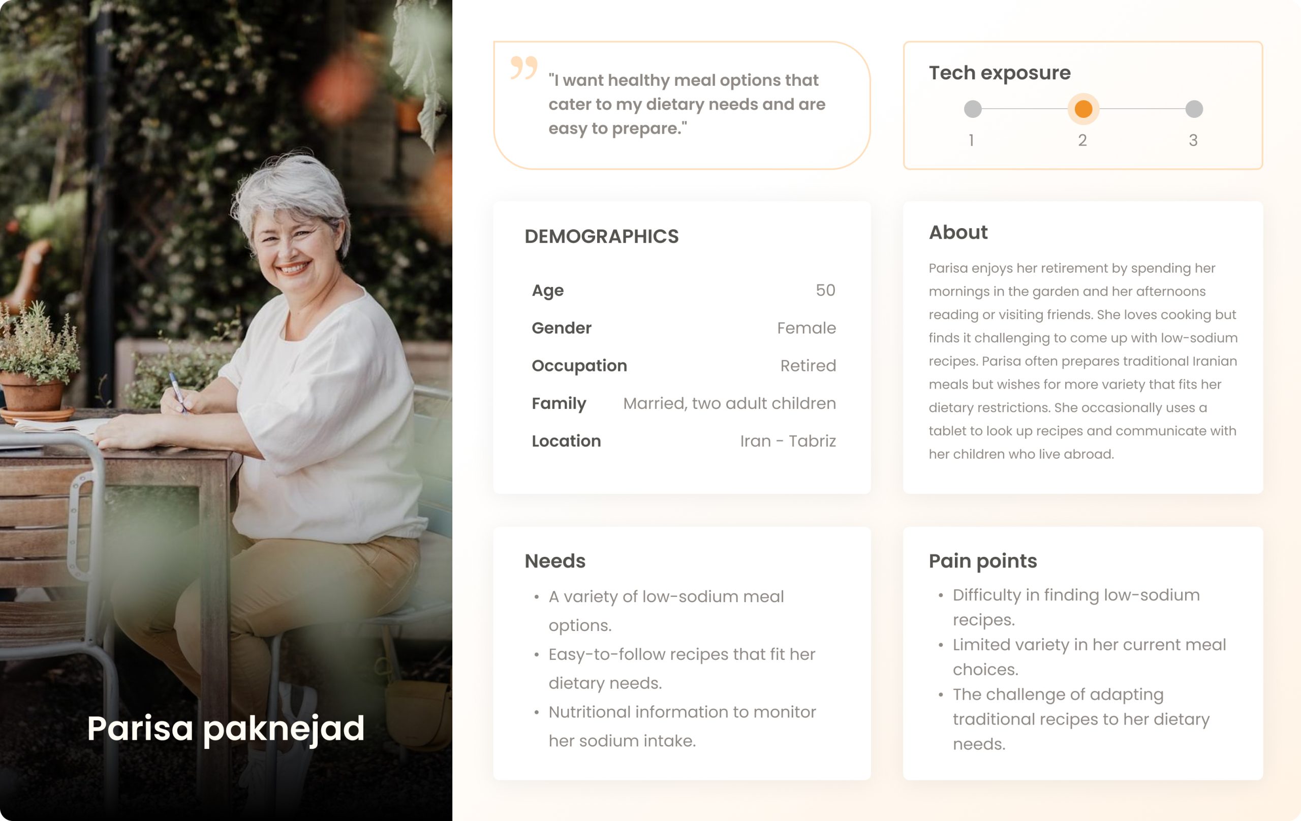
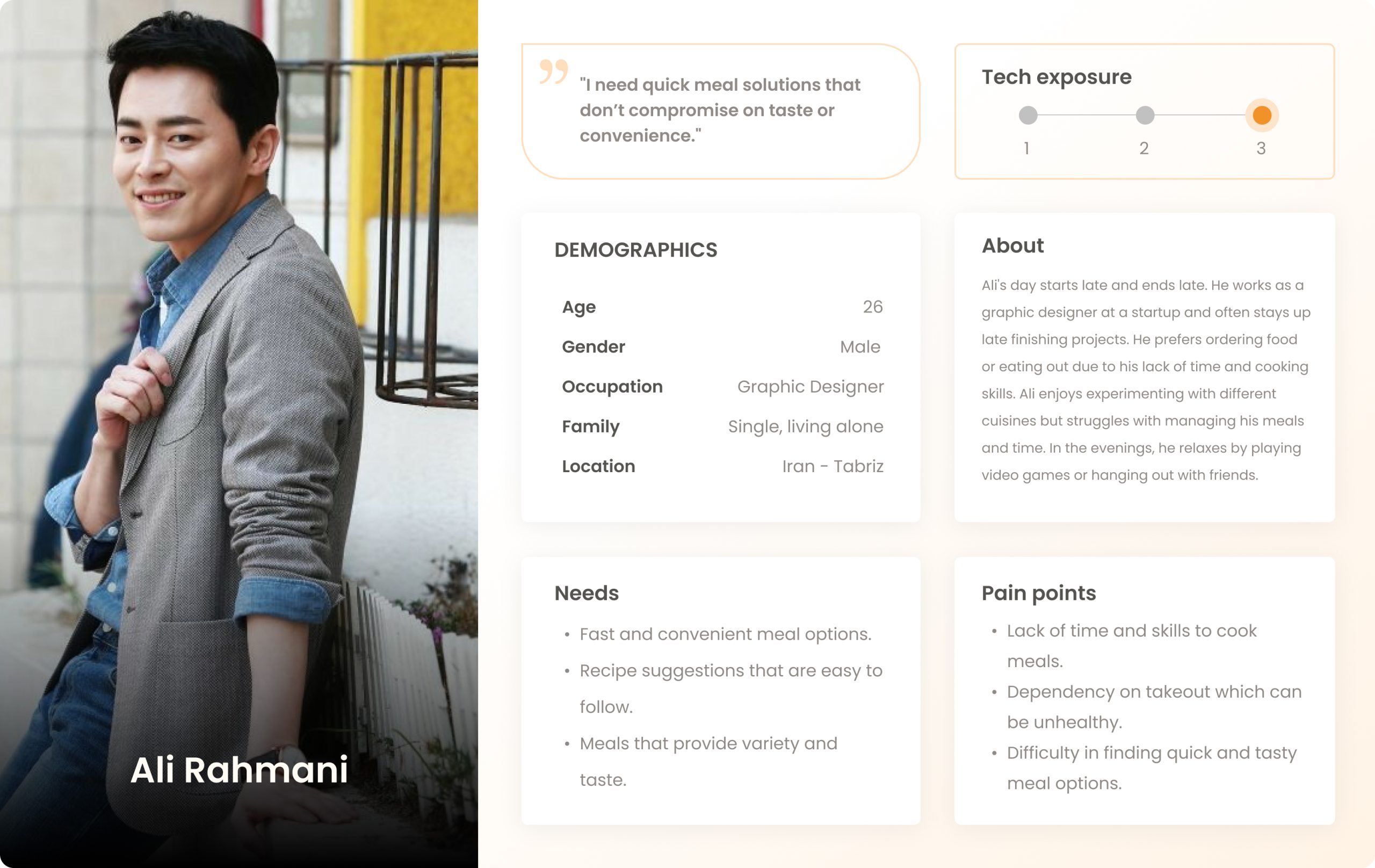
After analyzing the responses, I grouped the answers and chose to design four different personas to help make more progress. Visualizing user personas crafted from deep insights into diverse lifestyles and preferences, I highlighted key motivations, behaviors, and pain points.
Among these, I resonated most with Ali’s daily story because, as a designer, I understand what it’s like to be glued to a computer no matter the time of day 🙂
Maryam, a teacher mom
Reza, a market seller
Parisa, a caring mom
Ali, a graphic designer
4. User Journey Steps
Then, I mapped out the user journey from initial discovery through subscription and meal preparation. This visual representation highlighted critical touchpoints and potential pain points, providing clear steps for improving the overall user experience.
User Journey Map
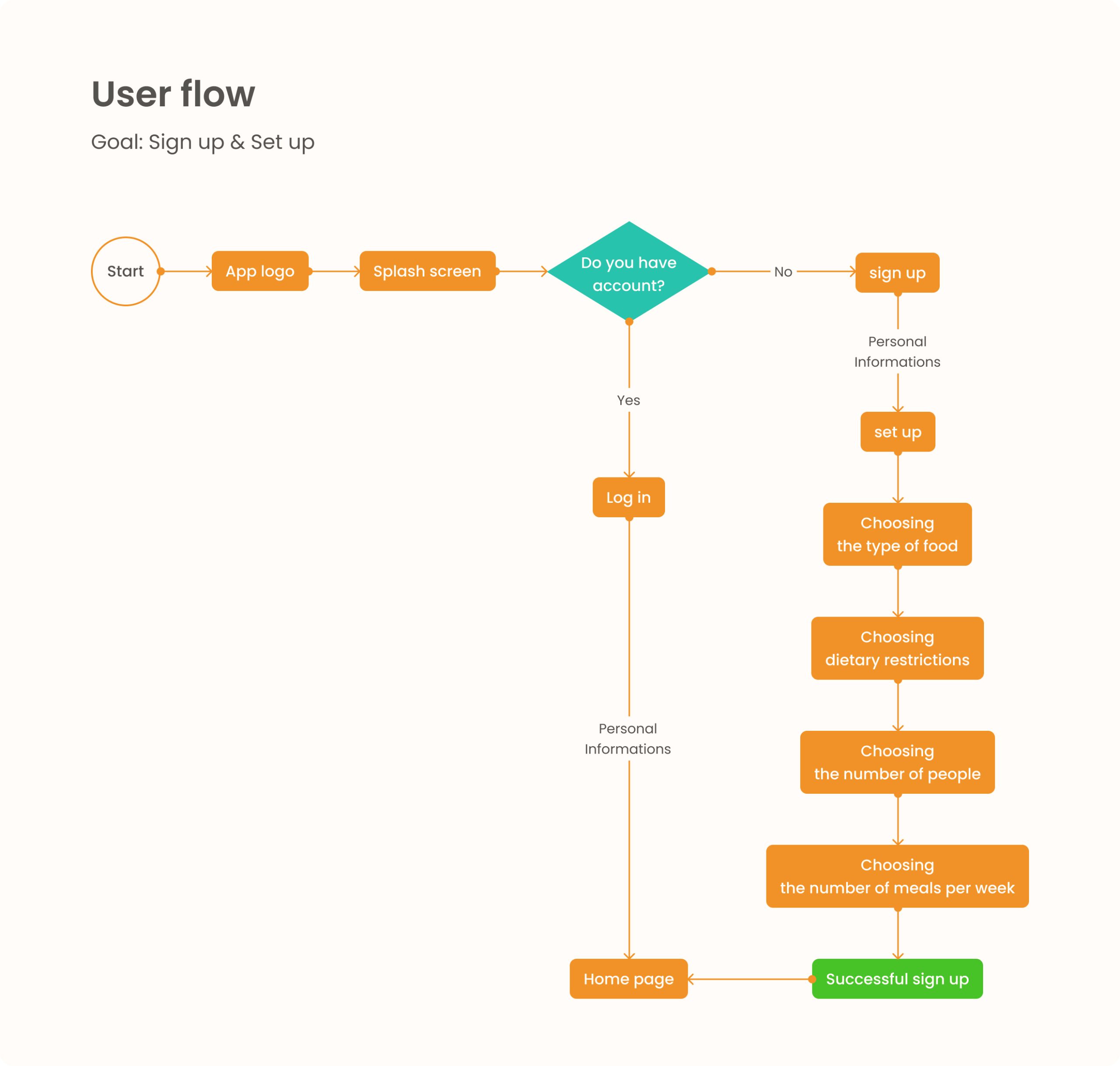
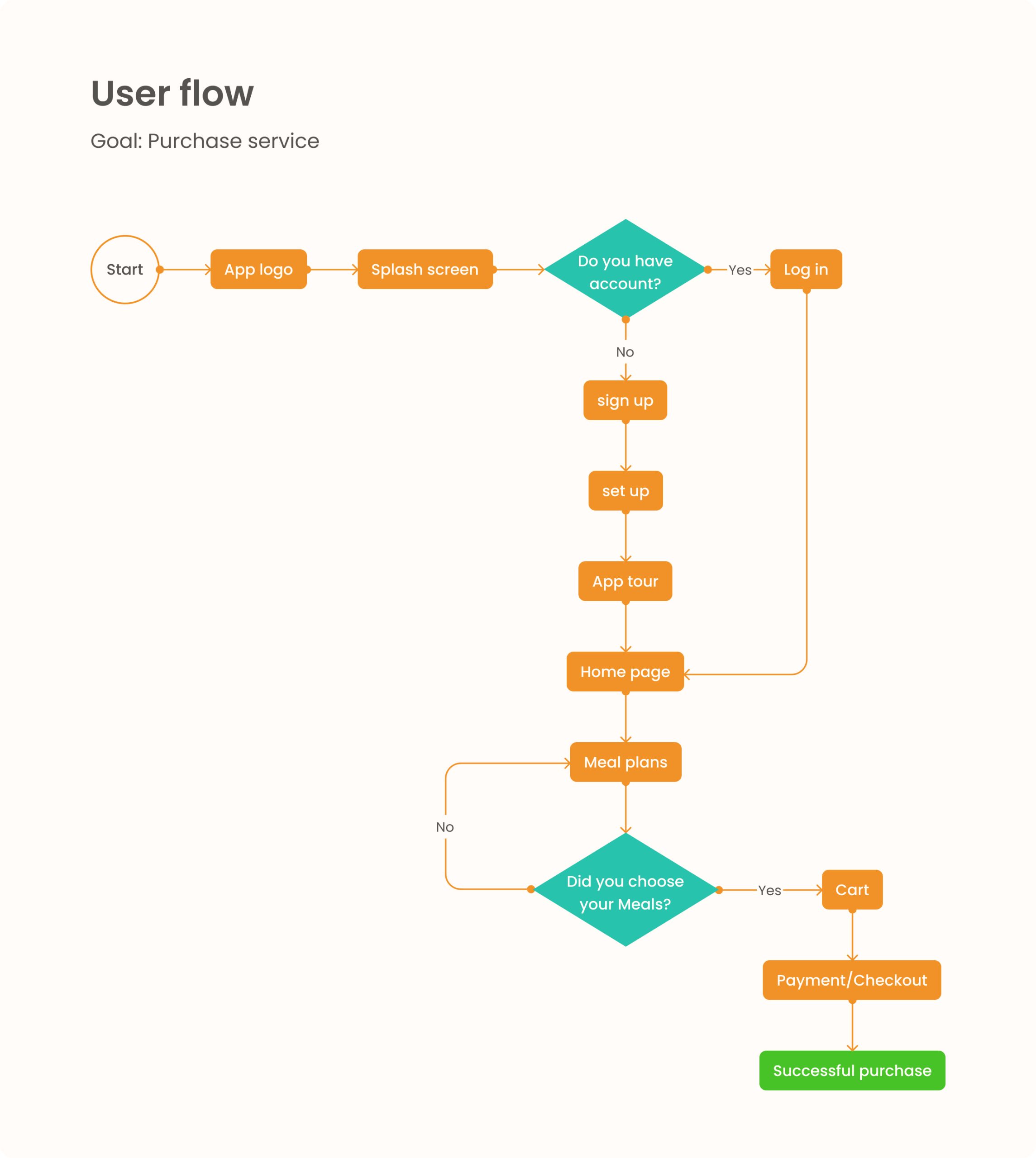
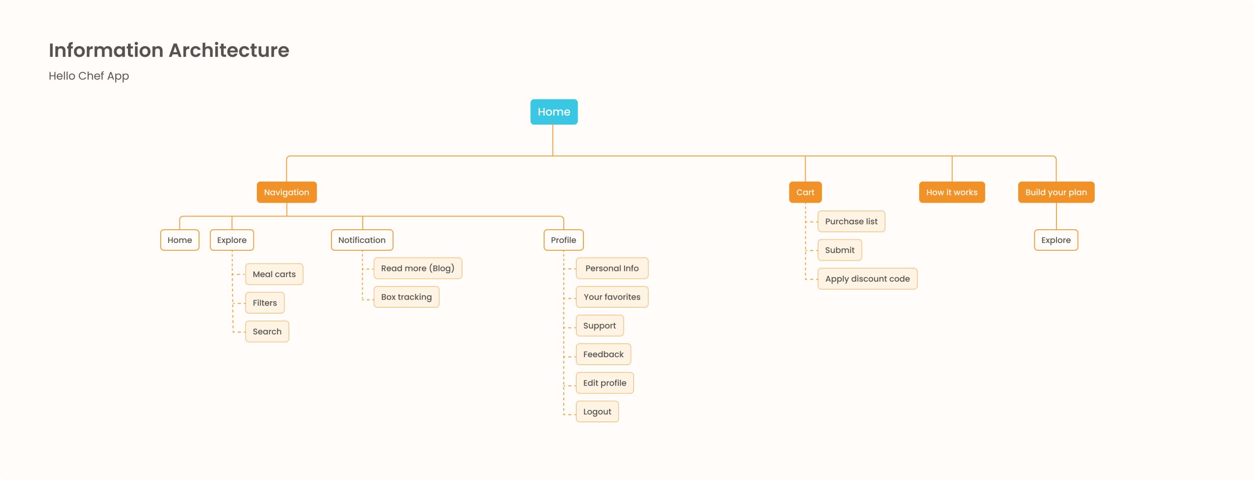
5. Information Architecture
according to the user journey map I tried to design user flows for the main tasks. note the important parts in sticky notes helped me understand the necessary pages and features. My goal was to make an easy navigation and be sure that users can access key features easily
Goals
Simplify navigation
Ensure easy access to key features (meal selection, subscription management, support)
Approach
Hierarchical Structure
using sticky nots
Sign up & Set up User flow
Purchase service User flow
The first iteration of Information Architecture
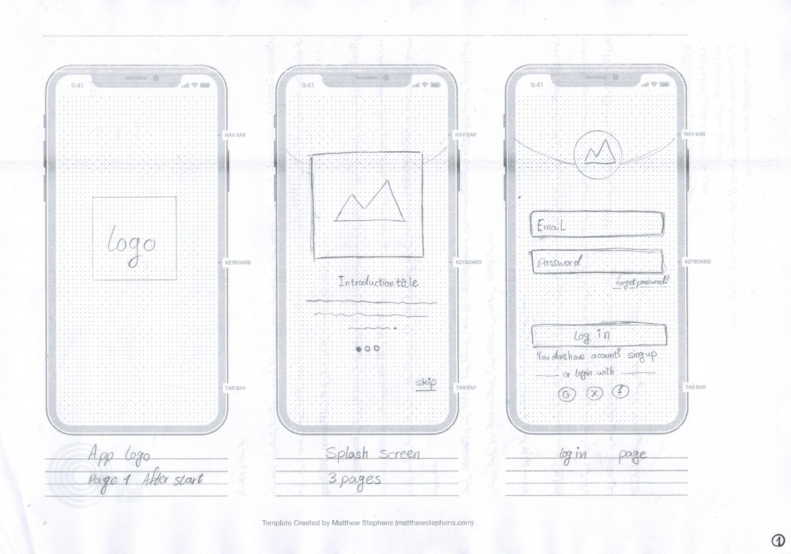
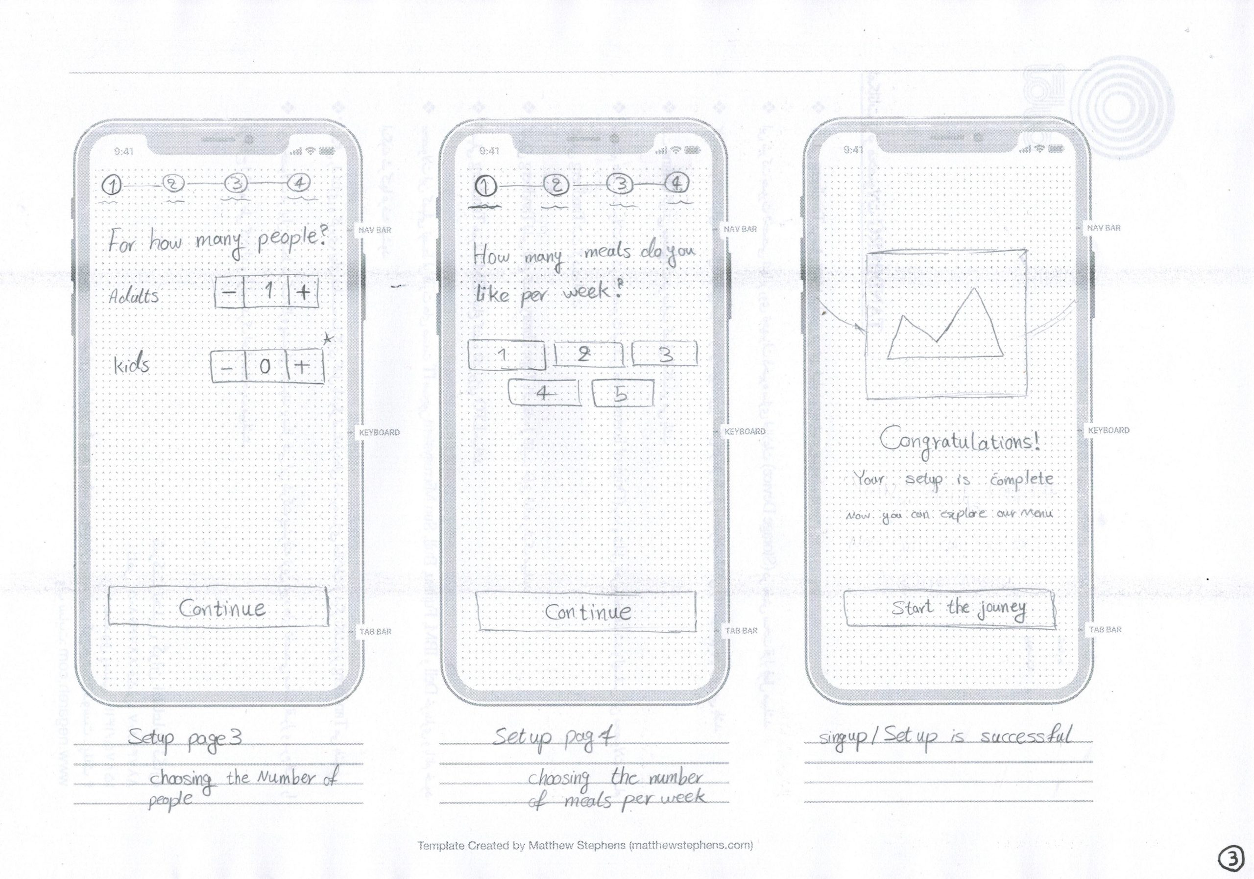
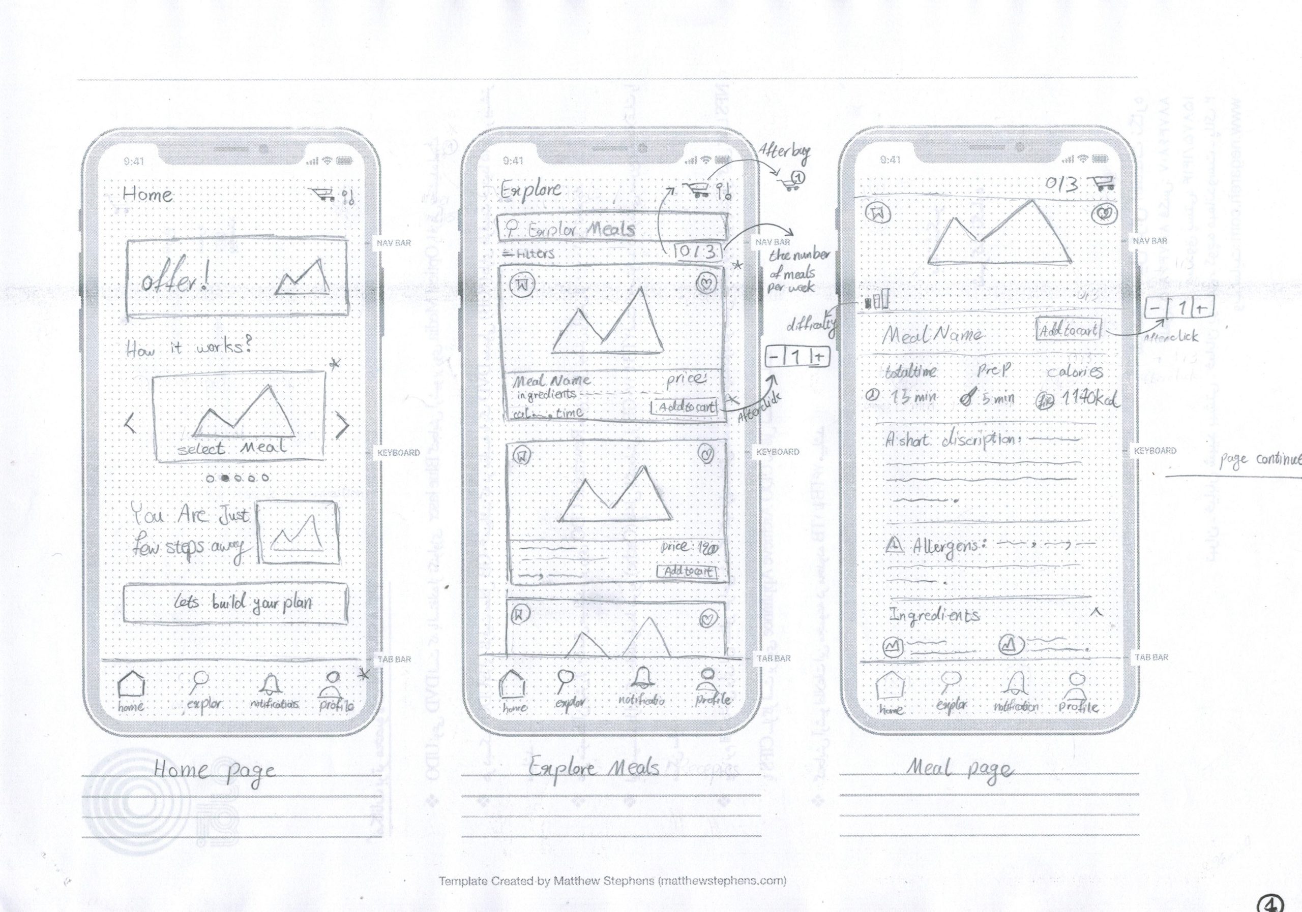
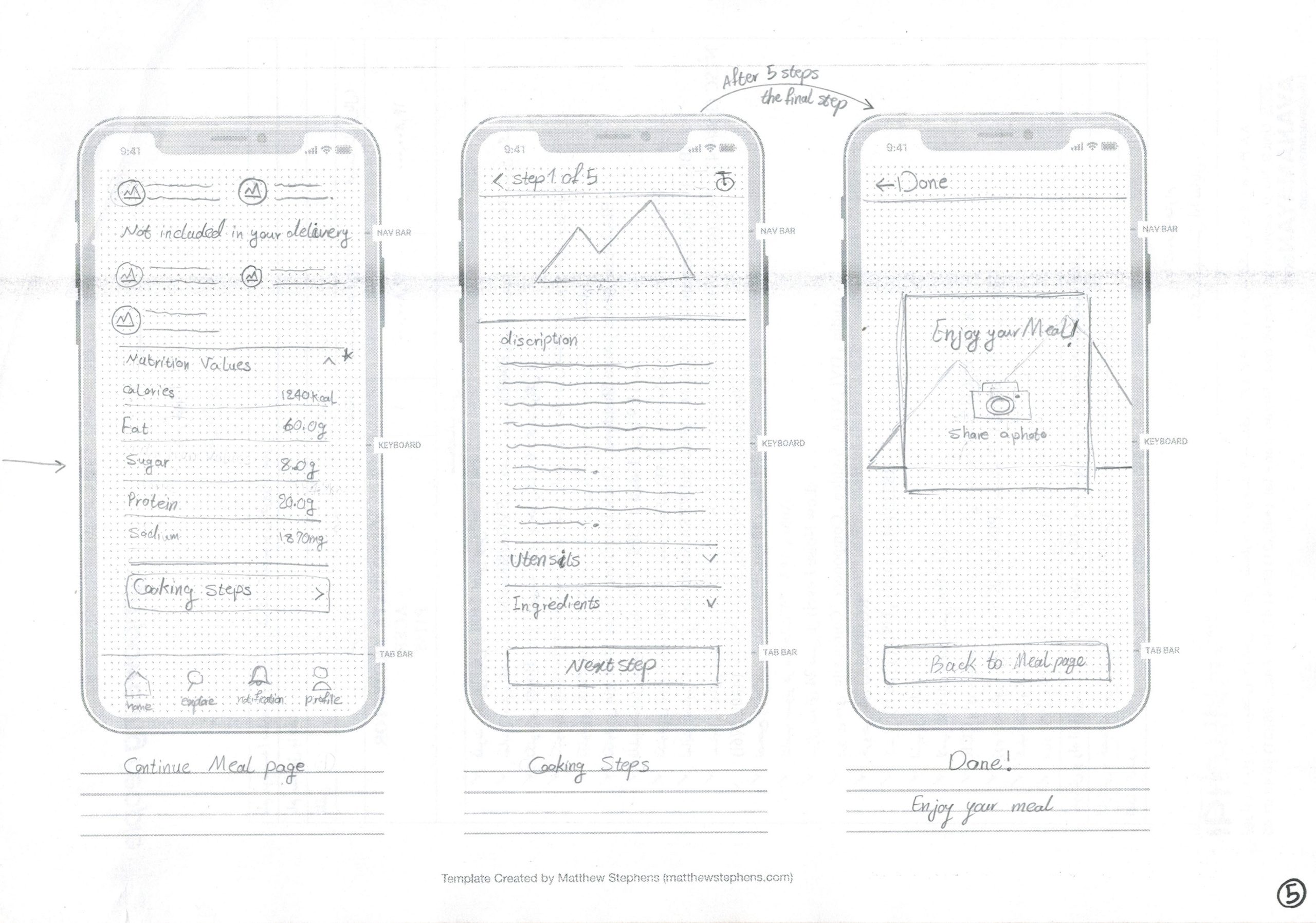
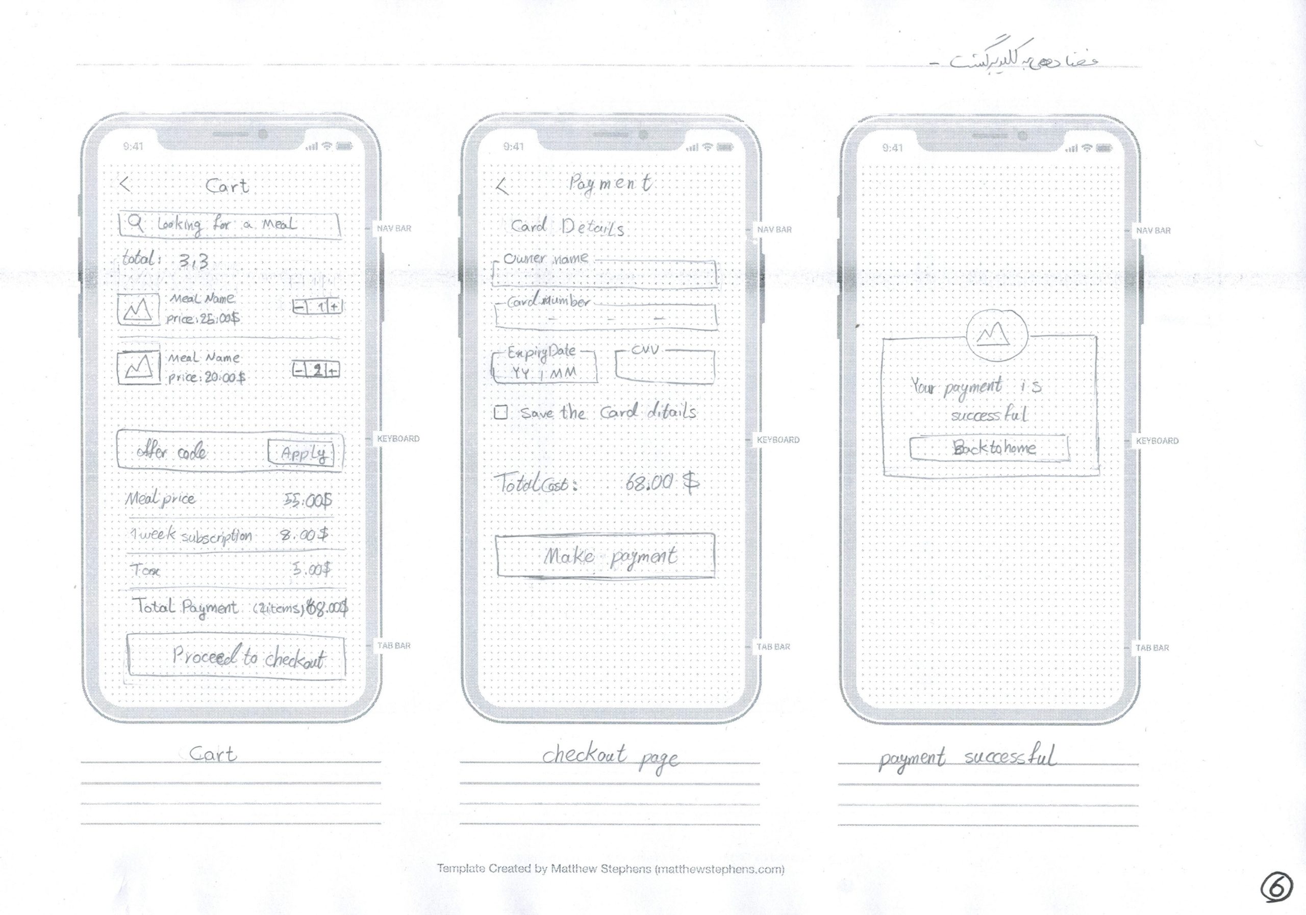
6. Wireframe Drawings!
I tried to draw my ideas for the main user flows I had in mind. Making the prototype helped the ideas come to life. I enjoyed a lot through this step.
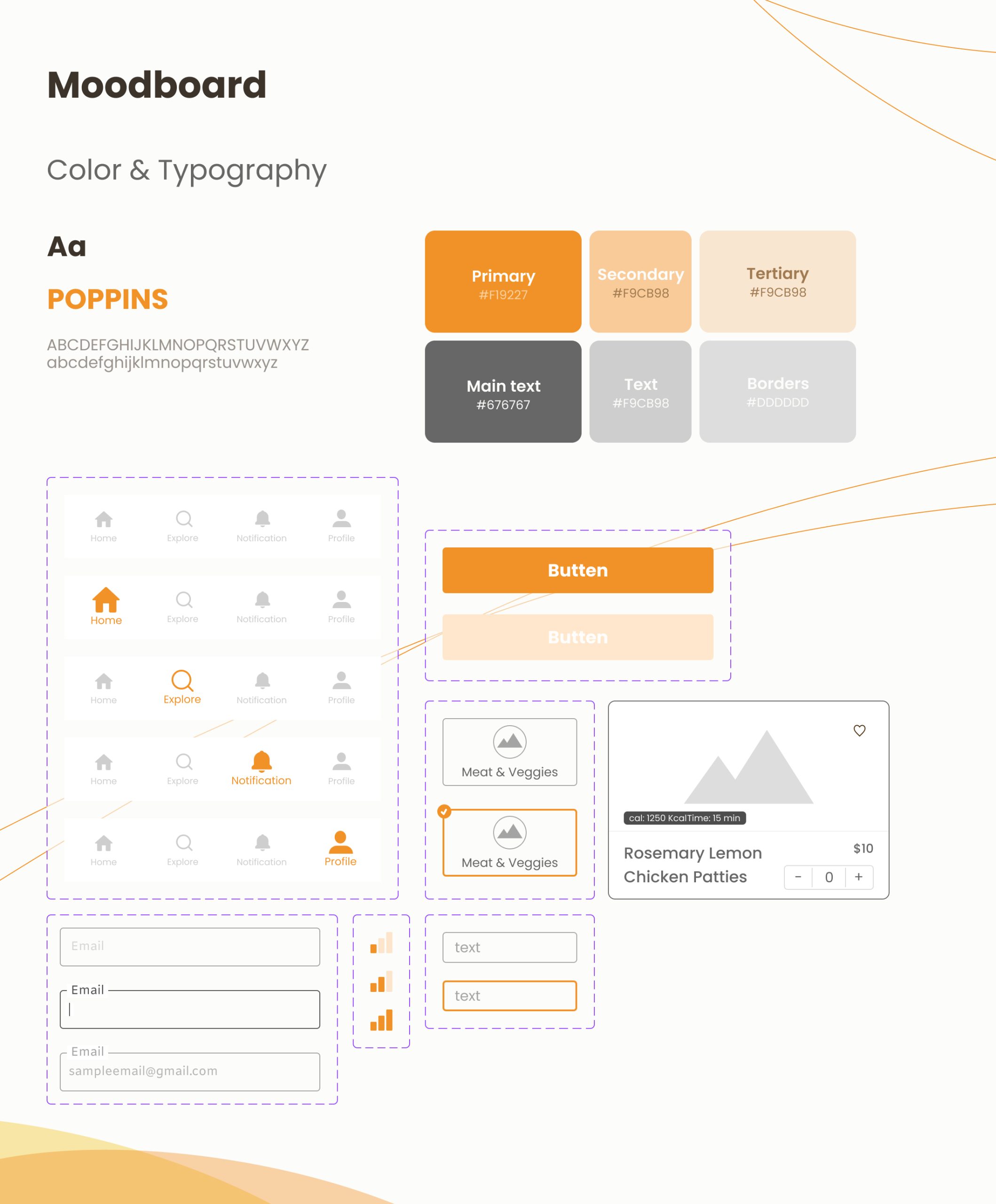
I choose to keep it simple and make changes in future designs. So I choose the monochromatic design with the orange color. Orange is energetic and vibrant, often associated with enthusiasm, and warmth, just like a memory with family.
And for typography, POPPINS was the chosen one. this font is clean and readable, and never disappoints!
Moodboard:
Fresh, vibrant color to evoke a sense of health and vitality
Clean, modern typography for readability
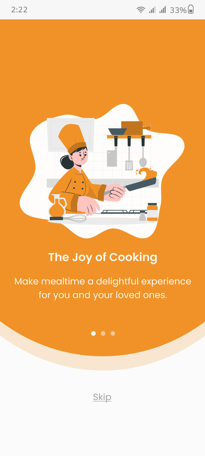
8. Prototyping & Finale Design
I made the wireframes to a colorful design and made some small changes in the navigation.
Interactive Prototype:
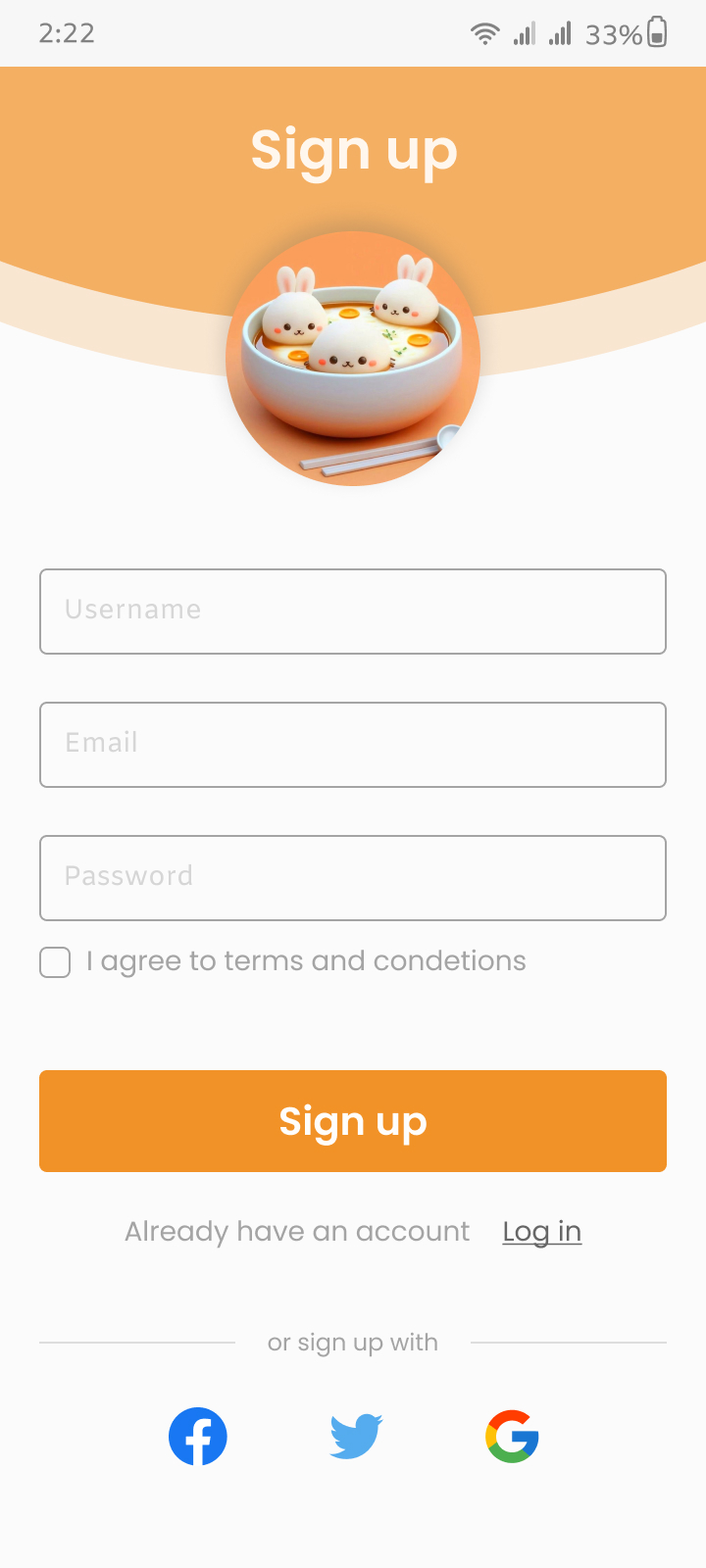
Created using Figma
Included key user flows: Purchase service and meals, Sign up & Set up, navigate a recipe
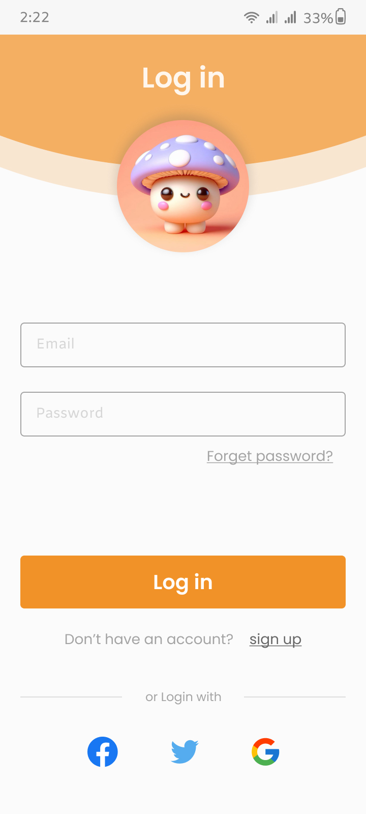
Designed pages
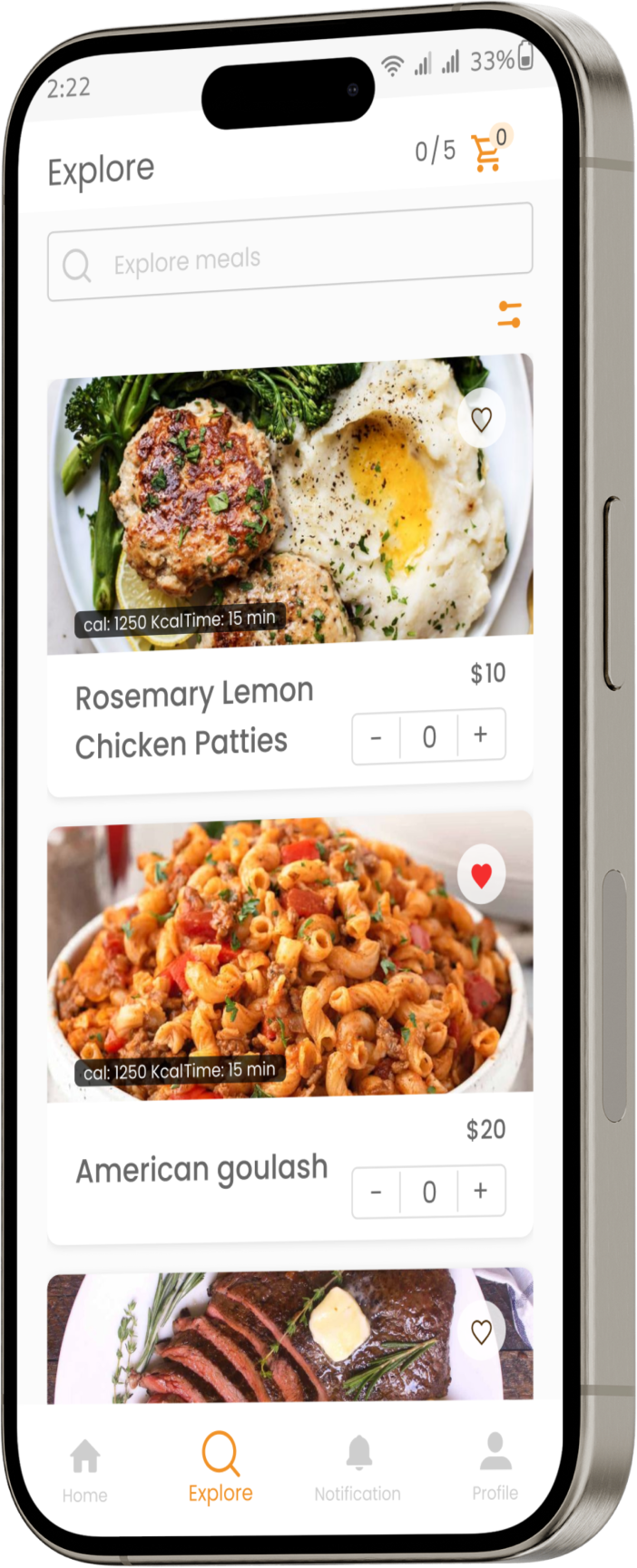
Homepage: an easy path to explore meals, explain the steps
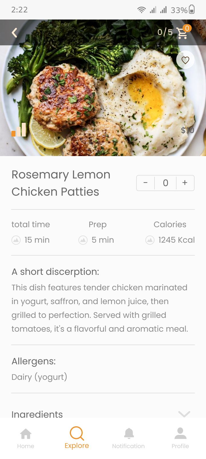
Explore section: meal cards with price and add to cart
Recipe Instructions: Step-by-step guides with images, tips, tutorials
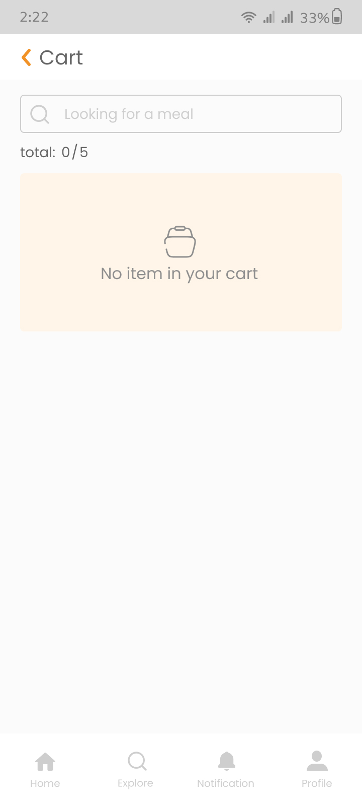
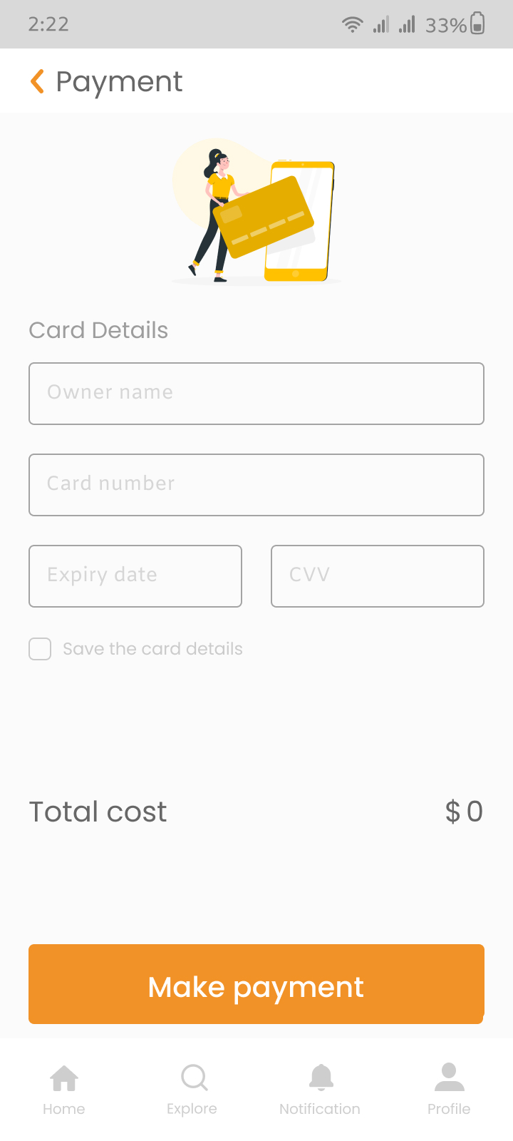
Cart:Selected dishes, description of payment
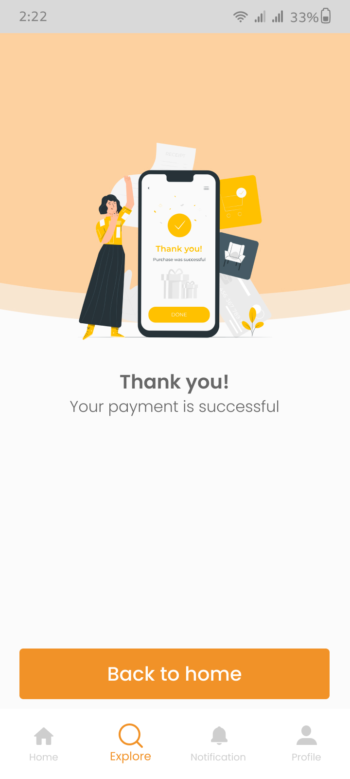
Cart Management: Easy-to-use interface, real-time updates, and secure checkout process
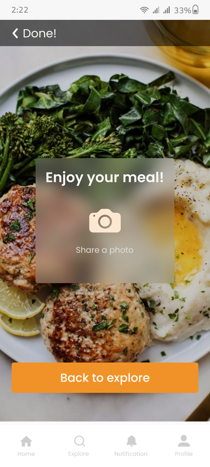
The Prototype Of The Finale Design
And The final result
Through this case study I tried to understand users’ needs and pain points to make a seamless and enjoyable experience interacting with Hello Chef.
I learned a lot and gained much more knowledge. This was one of my latest works and I hope I can continue working on it and upgrade the design and user experience too.
For now, we reached the end of this Case study
I hope You enjoyed the Hello Chef story
I hope everyone can create golden memories by spending time with their loved ones, whether it’s watching a movie or making a delicious meal together.